Streetscapes
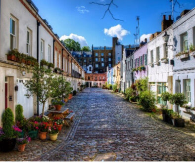
Successful streetscapes are defined by spaces between buildings. The spaces become successful places; streets where we live out our lives, nooks and crannies that create pleasant oasis, buildings that form backdrops and walls that give meter to time and space….all decidedly urban concepts.
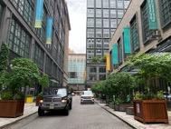
A downtown Chicago streetscape
Let’s take the flipside to this thought and think of streetscapes that are defined by buildings between spaces. Eye catching, exuberant buildings and identity signage set inside parking lots, or man made landscape that won’t detract from the eye catching, exuberant buildings and identity signage. This is the essence of the suburban experience.
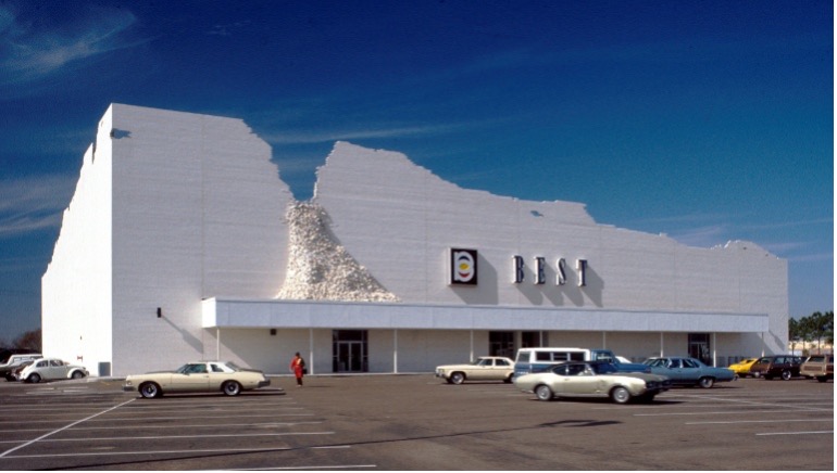
Art becomes life in this retail structure from the early 1970s.
The idea of negative, rather than positive space – or however you want to cast it – is something that Victor Gruen thought was America’s downfall, yet something that Robert Venturi has portrayed as a quality deserving of American pride. Instead of abiding by the rules of being polite to our neighbours in context, we simply build as far away from our neighbours as possible, to be something individual. One could even draw similarities between this design comparison and the way our society functions today. Art becomes life.
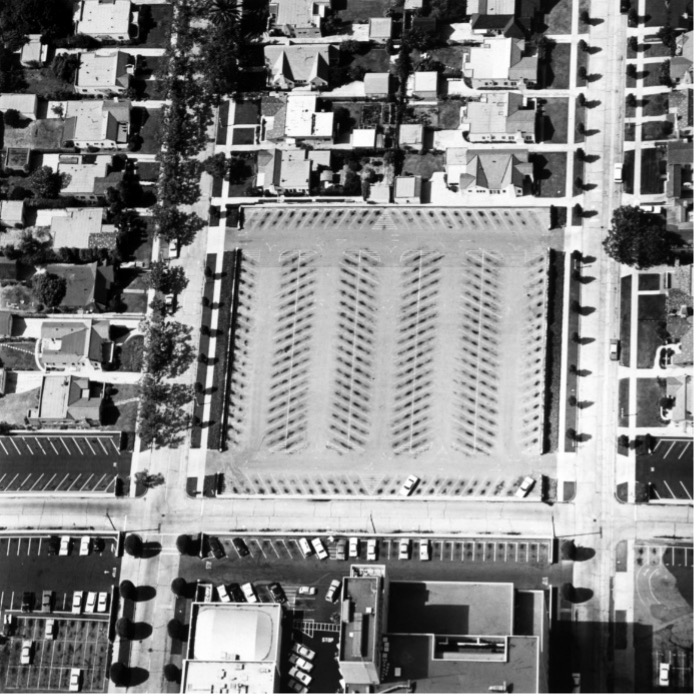
Edward Ruscha’s bird’s eye view of parking lots
Let’s go a step further. In the urban streetscape, one approaches places on foot, whereas in a suburban streetscape, one approaches a place while inside an automobile. Between suburban buildings, places are populated by automobiles – in motion, or being stored.
Beat era guru Edward Ruscha looked at parking lots and ancillary landscaping much the same way that Andy Warhol looked at soup cans. Testing this hypothesis, the elements of suburban streetscapes aren’t buildings or ancillary landscaping – let’s get down to business here, folks – it’s our cars. despite the advent of “dress down working environments” and “casual Fridays”, we still devote time and effort to primping our automobiles. Though we eat junk food, we would never fuel our cars with nothing but the best gasoline and motor oils. We dress them up more than we do ourselves, quite often.
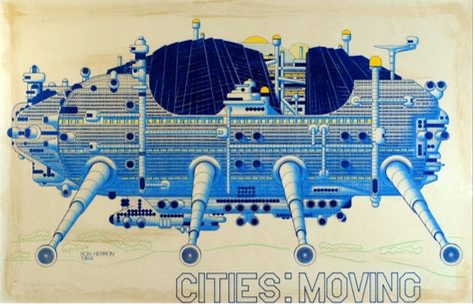
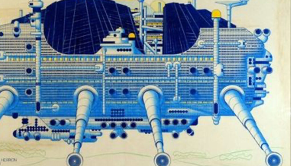
Mobility as architecture
The British movement ‘Archigram” recognized this concept of mobility as architecture well beyond our suburban bounds. they imagined buildings that could move to new settings if one was bored with the existing one. Still others envisioned our transportation as a type of clothing, an extension of our persona – our automobiles are every bit a part of our personal image as are our clothing. More imaginatively, one could devise a set of clothes that become our environment and transportation, all in one. Imagine a set of trousers that sprout wheels and take one to work on a busy freeway; what about jackets that double as jet packs and rocket one to another continent for an afternoon visit…or inflatable coveralls that provide the ideal, temperate indoor environment while visiting the arctic, the jungle, or outer space…Spacesuits are clothing that provide all necessary support for life, much like any other built environment. But, are they architecture?
Back on earth, or at least the North American suburb, we need interesting parking lots to sustain a vibrant suburban streetscape, flamboyant buildings on their own just don’t cut the mustard. Detroit’s “Big Three” did better when they recognized this, and designed cars every bit as exuberant as were suburban buildings. However, gasoline was cheap and abundant, we could fuel this type of environment. Now that automobile styling is boring, dull and gray; and that gasoline is reaching record prices, it’s time to rethink.
Suburban streetscapes are left with highly individual buildings with parking lots. Parking lots have become prime real estate, they tend to have supported commercially successful buildings whose only direction to expand are into their parking lots. Suddenly, these exuberant buildings that stood alone in their flamboyance are cheek and jowl with other, dissimilarly exuberant buildings. And they’re still approached by automobiles.
Understanding a suburban streetscape, and retrofitting it for the new century is one of our greatest challenges.
Darrel G. Babuk, NCARB, MRAIC (retired) is the Founding Principal of Boreas Architecture & Civic Design, Inc, an Alberta based Architecture and Urban Design practice.

